Rearview Engineering Platform
When a deal was live, an outage didn't defer revenue — it stopped it in its tracks. I designed the monitoring tool engineers used to see system health at a glance and act before small failures cascaded — built in direct partnership with the engineers who'd live in it.
Experience lead, internal engineering tools
Monitoring platform — system health, alerting, incident diagnosis
LivingSocial engineering, on-call engineers
Working sessions with on-call engineers, alert channel testing
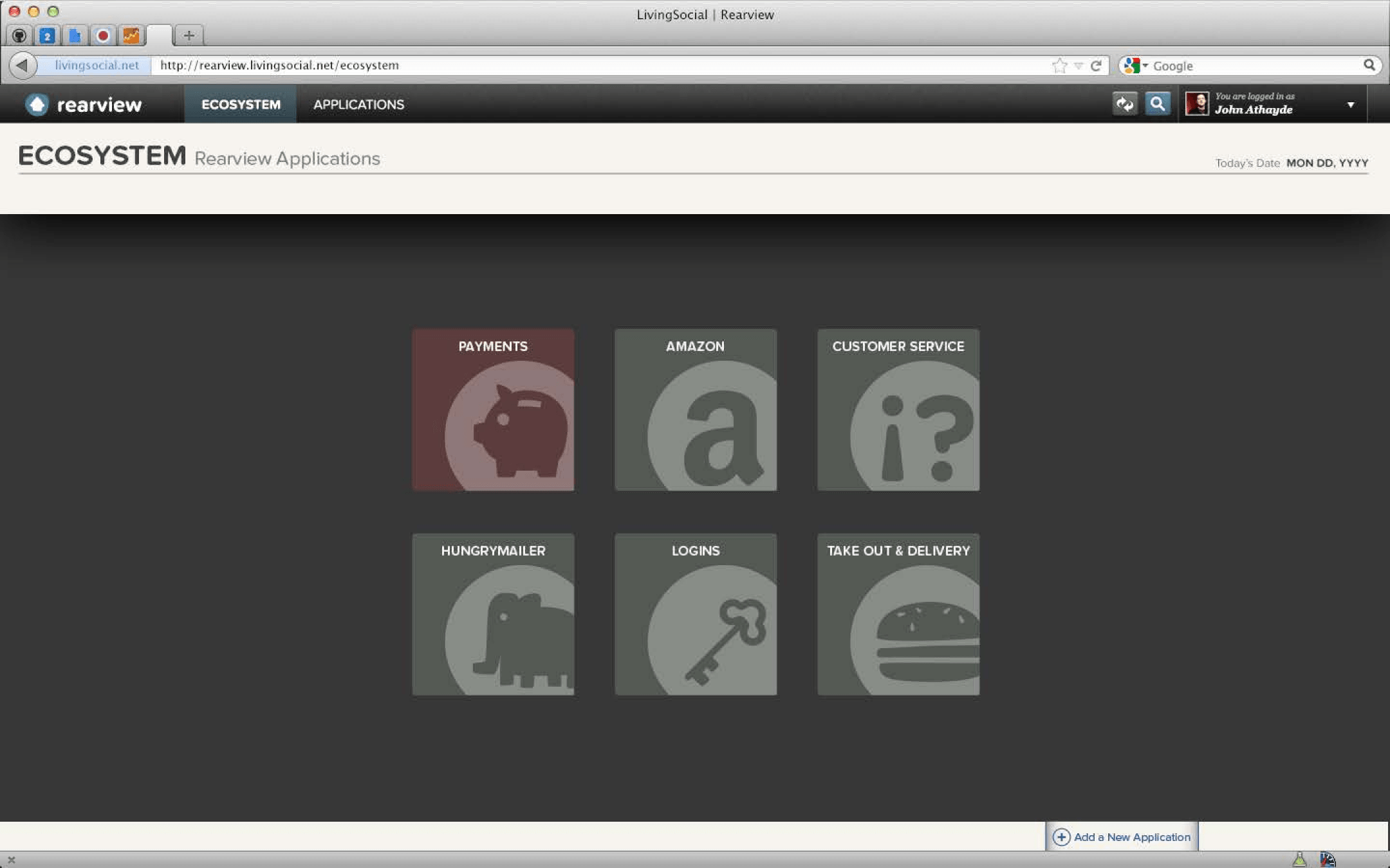
Ecosystem view. Every monitored application, one screen, one question answered before the engineer has to think: which of these needs me right now.
WHERE IT STARTED
Nobody browses a monitoring tool. They open it at 2am.
LivingSocial ran on deals with a fixed sales window. An outage during one did not defer revenue — it deleted it. And the failure was rarely that nobody noticed. It was that the engineer who noticed could not tell fast enough which system was actually broken, or what else was about to break because of it. Every minute spent orienting was money that did not come back.
That set the design constraint before anything else did. Rearview's user is not at a desk with coffee. They were asleep four minutes ago, they are being paid to make a fast correct decision, and they are working with the smallest amount of cognitive capacity a person has all week. Comprehension speed beats feature depth. A screen that reads as clear in daylight can still fail at 2am, and the only way to know is to design for the second condition.
The pager beat every channel we thought was better.
Alerts went out by text, phone call, email, and pager. In testing, the pager got the fastest response.
That was not the answer anyone expected in 2013, and it was easy to treat as a joke about obsolete hardware. It was not. The pager was the fastest channel because it was the only channel that meant one thing. A text competes with every other text. Email competes with everything. A pager going off in the dark carries no ambiguity about what it is or whether it can wait.
The finding changed what we originally planned for. If the alert channel's value is unambiguous meaning, then the tool's job on arrival is to preserve that clarity rather than dump the engineer into a wall of graphs. So the entry point became an ecosystem view — every monitored application on one screen, one obvious answer to "which of these needs me" — and depth lived one level down, in the per-application dashboard, where an engineer who had already oriented could work.
I did not get that from asking engineers what they wanted. I got it from tracking which alert they answered first.
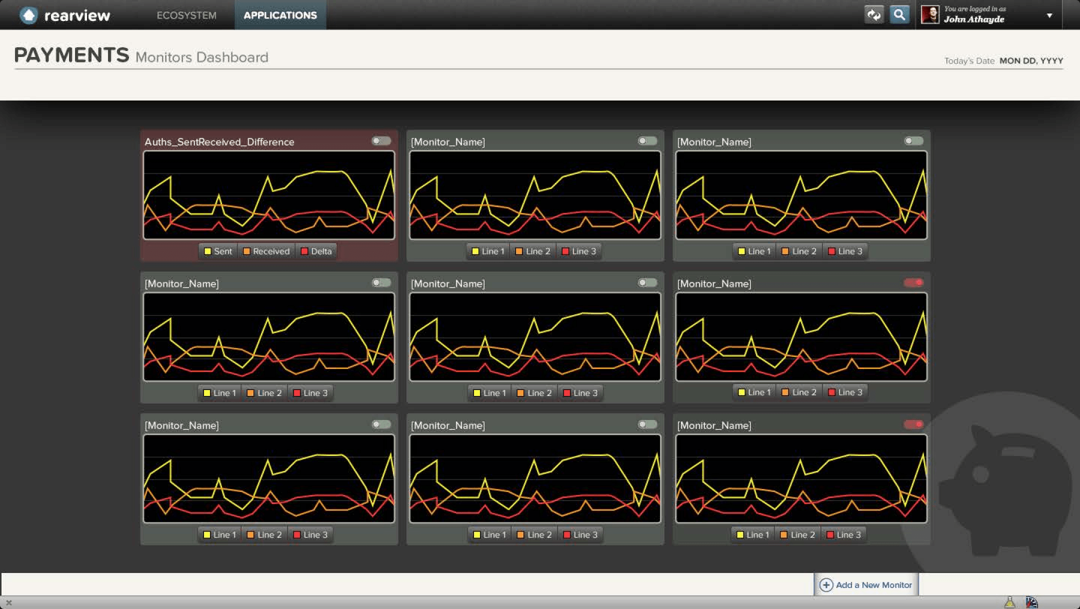
Per-application dashboard. Once an engineer knows which application needs them, every monitor for that service is visible at once — status at a glance, detail one click away.
Building for the three minutes that matter
From the application dashboard, an engineer could see every monitor's alert state at once, then open a single monitor to diagnose it — scrubbing back to any incident in the recent past, zooming for more or less detail, testing metrics and expressions against real data before committing a change.
That last part was a deliberate concession to a user I could not sit next to at 2am. Engineers needed to author and tune their own monitors without design or product in the loop, so the configuration surfaces had to be honest about the underlying system rather than simplified into something an on-call engineer would stop trusting. I spent design capacity on making the mechanics visible instead of on making the tool look approachable to someone who would never use it.
I spent design capacity on making the mechanics visible instead of on making the tool look approachable to someone who would never use it.
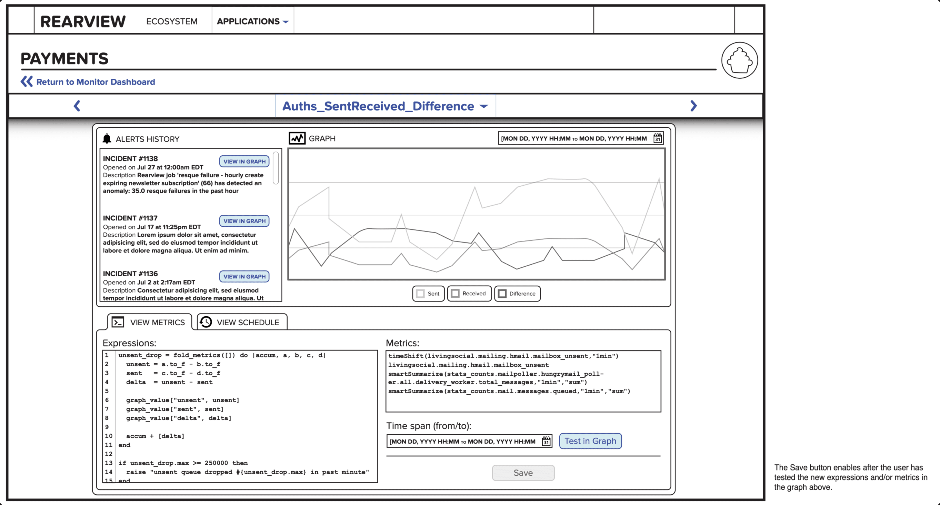
Monitor detail, wireframe. Alerts history sits beside the graph so an incident and its data are readable together. The annotation at right is the decision that mattered: Save stays disabled until the engineer has tested the expression against the graph. Nobody ships an untested alert at 2am.
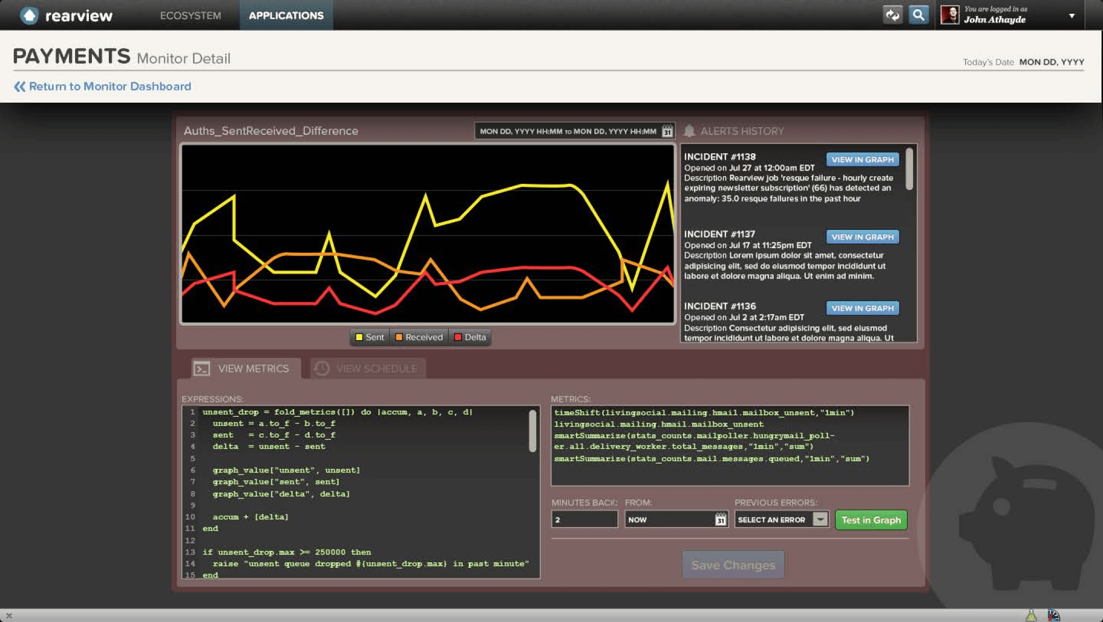
Monitor detail, final. Two changes from the wireframe, both from working with the engineers. The graph moved to the primary position and the series got color, so the anomaly is visible before anything is read. And the absolute date range became "minutes back from now," with a jump to previous errors — because an on-call engineer's question is never "show me July 17," it's "what just happened."
The tradeoff worth naming: Rearview is dense, and it was built in direct partnership with the engineers who'd live in it, which means it is fitted to them and would not survive contact with a general audience. That was the correct call for an internal tool with a known population and a known worst case. It is also the reason a tool like this quietly rots when the population turns over and nobody re-runs the research.
The pattern showed up again years later, with different users and a much larger population. People who do not choose their tools do not send feedback. You have to go find out which alert they answered first.