AXA Vantage Agent Portal
A professional portal for insurance advisors managing complex client portfolios — turning dense, regulated financial data into workflows an advisor could actually move through with their clients.
Experience lead, agency engagement
National career-agent portal — product library, client guide, courses, news, glossary
AXA executives and field managers, HUGE product manager and visual designer
Field interviews with agents, stakeholder interviews with executives and managers
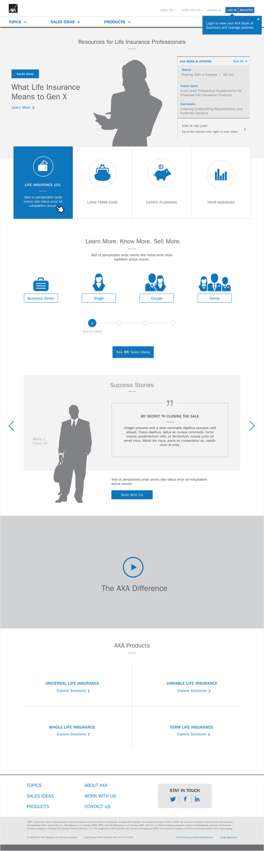
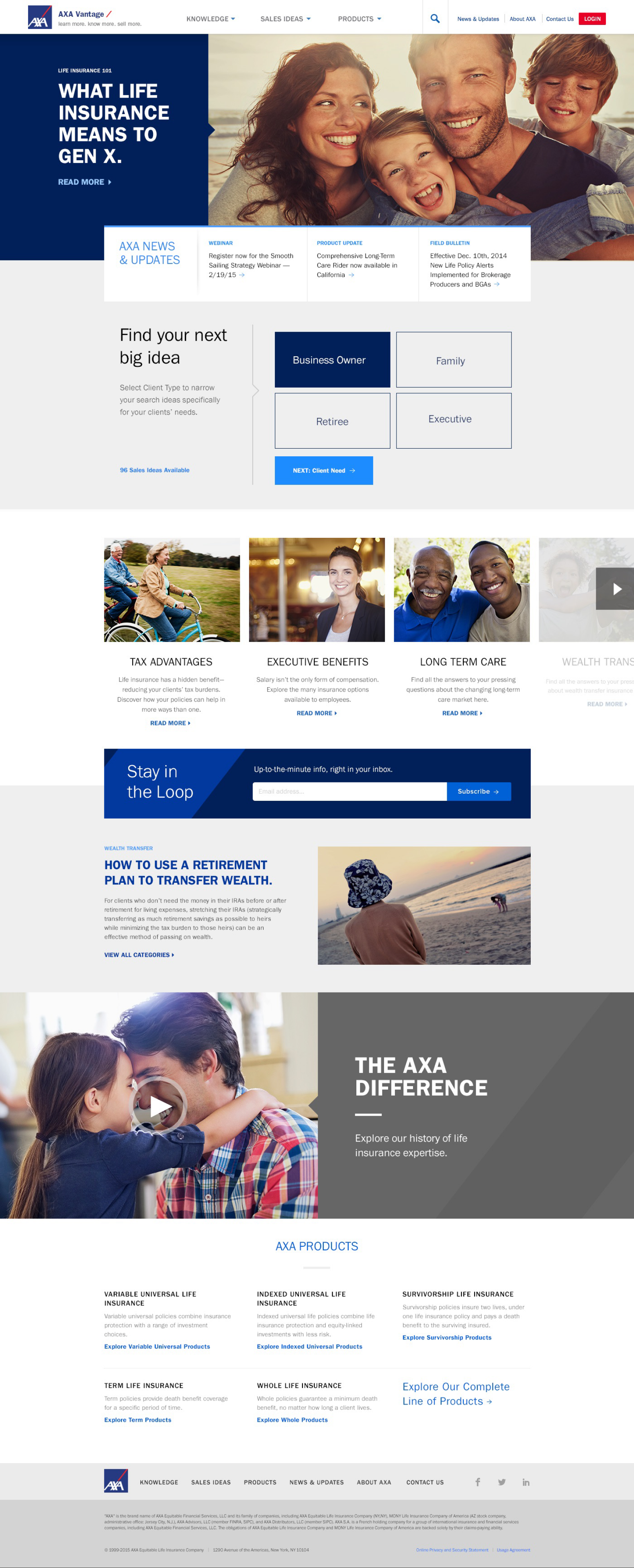
Wireframe to final. The concept for the home page was a well-organized front door to a library that kept the agent informed in the office and on the road.
WHERE IT STARTED
Agents would drag brief cases (some had suit cases) full of pamphlets and guides.
An AXA career agent cannot switch to a competitor's product library. They can, and do, work from memory. An agent sitting across a kitchen table from a client does not stop to search a portal — they recommend the product they already know well, out of dozens they could have recommended. That was the real failure mode the portal had to solve, and it was not the one we were hired to solve.
There was no old site to replace. There was a brief case. Agents carried a library of printed pamphlets and guidebooks to every appointment, and the pamphlets worked — an agent could pull the right one, hand it across the table, and leave it behind. So I spent the first weeks asking agents about their appointments rather than about software, and what came back was a physical workflow: what they packed, what they ran out of, what they handed over, what the client kept.
The incumbent was not a broken system. It was a system that fit in a brief case.
We moved the library from the brief case to their laptop.
Executives and field managers described a distribution problem. Printed material goes stale, reprints cost money, and an agent in the field is carrying whatever they packed that morning. All true, and all solvable by putting the pamphlets on a server.
The agent interviews described something else. Nobody was struggling to locate a document. They were deciding which of dozens of products fit a specific person — age, dependents, income, risk tolerance, what the client already held — and then finding the material that supported that recommendation. The packing decision at 7am was the same decision, made earlier and with less information. A searchable library would have handed an agent forty correct documents and left the hard part exactly where it was.
I did not have language like "captive customer" yet. What I had was a research finding I could not reconcile with the brief we had been given, and a product manager willing to reopen the brief.
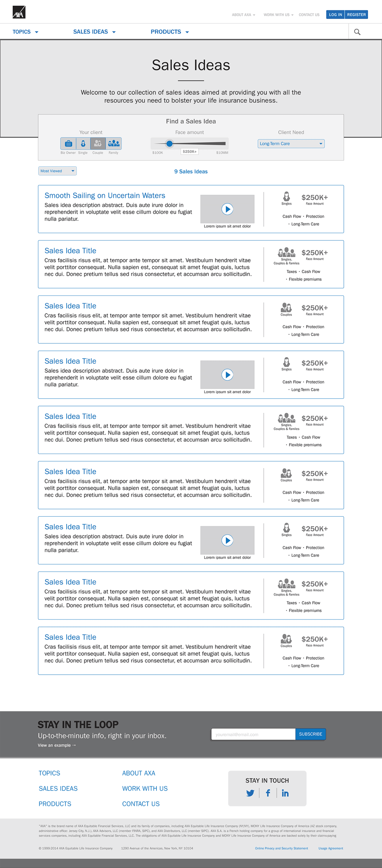
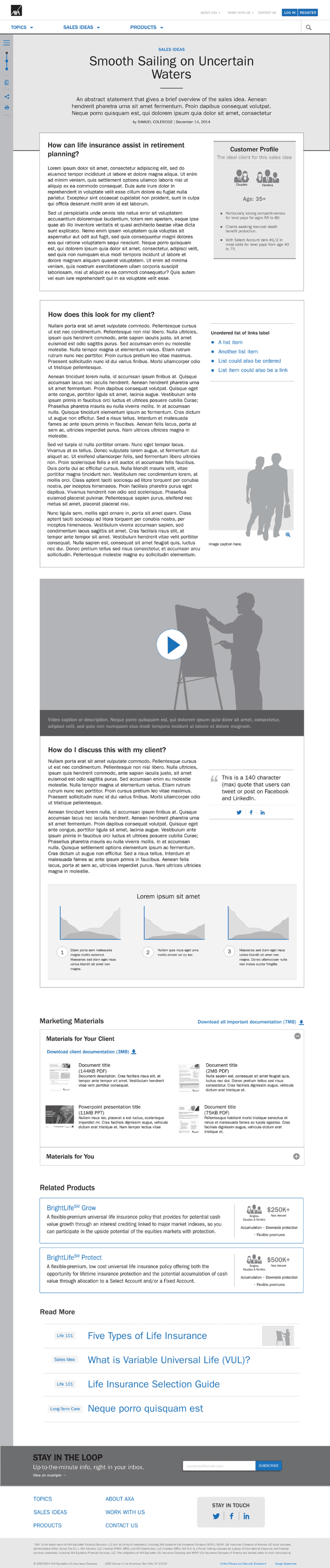
The reasoning is the artifact.
I proposed centering the portal on a guided client assessment. The agent asks the client a short series of questions — in person or on the phone — and the portal resolves the answers into a tailored product recommendation and the documentation that supports it, ready to print ahead or email to the client on the spot.
The constraint that shaped every screen was that this happens in front of the customer. An agent working a form while a prospect watches looks like a clerk, and an agent who looks like a clerk loses the room. So the assessment had to read as a conversation the agent was leading rather than a record they were filling in — few questions per screen, plain language an agent could say out loud verbatim, and no visible dead ends when a client's situation did not fit cleanly.
The product manager and I built a shared vision of the portal so AXA's stakeholders and the development team were arguing about one picture instead of three. I set creative direction with the visual designer rather than drawing the final screens, which was a deliberate trade: I could hold the argument with the client and keep the assessment from being value-engineered into a search filter, or I could push pixels, and not both on that timeline.
Two costs worth naming. A recommendation engine is only as current as the product content behind it, which pushed real ongoing work onto AXA's content owners — a wizard that recommends a discontinued product is worse than a pamphlet. And the home page still got an editorial, magazine-style treatment answering the brief as originally stated. It consumed design capacity, and I would defend about half of it now.
The client asked us to move a library. What the agent needed was the freedom to make decisions with their customers.